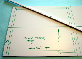
The following is my new way of constructing the trays, but keeping a similar look to what was done previously. Below you see that I laid out the tray dimensions using a marker and my steel carpenter's square. I'm building two at once here for my 6-wide Chaos Knights units.
Nowadays, I just use strips on the front and sides, leaving the back open for the expansion of the unit or addition of a character model. I also build the trays slightly wider than the bases usually one or three tenths of an inch wider to help fit in that odd conversion, a bit of slop if you will. If you have messed around a bit with GW's modular trays, you'll note a bit of play in them also. Using the thick plasticard and strips you can also add magnets to them. On the pictured VC Bashin' Orcs tray in the previous post, the commissioner instructed me to use GF9 bases, so that tray has magnetic sheet in the tray to work with the GF9 bases, as does my Knights Hospitaller unit.
So now we have the below, the general layout of what the trays will look like. The 0.2" lines are the general guidelines for the strips that will come later. The 0.3" is the outside of the tray. I normally make that a bit larger nowadays (out to about 0.4-0.5"), but with these I'm trying to somewhat match what I had done previously.
If you have not worked with plasticard before, all that needs be done with it to cut it to shape, is to score the cut line with your razor knife. Here I use the steel edge of my carpenter's square as the guide for my xacto blade.
Then take the plasticard and bend it all that scored line.
The card will snap along that scored line.
Do this a couple times, now I have the two tray bottoms.
Next up, is the strips. Similar procedure as the above. Score the strip, bend and snap it along the scored cut line.
Here you see a bunch of the pieces. One thing to do that make things go much quicker is to glue the sides on the tray. Then lay the front strip on the tray, mark it to the right size and cut it, no need to even measure it out.
Then glue the front strip into place, and you get what we have below. Wow...very square, uninspiring, and just plain boring when placed next the end goal. We have to fix that.
First thing is get rid of that square shape, there is enough square corners in Warhammer, we don't need to add more to that. What I'm looking for is a softer shape. So below I took my clippers and clipped the corners.
Next up I will round off the corners, which you can do that with a file or sander. Here I have cheated and used my power tool, a dremel.
The above is still kind of boring, but you may have noted some of the pictures had the Aves Apoxie Sculp pictured, we'll soon fix all of that boredom.
But first...I'm still attempting to mimic what I have done in the past, so I have to do a bit more work. Nice irregular, and semi-random edges.
So there you have it...the basic tray construction. Next up...I will breakout the Apoxie Sculp.


Ah, interesting way to execute the edges - broken ground. Nice tutorial and a way to guarantee the fit of the bases. Best, Dean
ReplyDeleteYep it looks good. Does it et in the way when gaming? I assume you need to clear everything up first with non-regular opponents.
ReplyDeleteGood one, I'm very interested in the progress, I'm planning to steal this ;)
ReplyDeletethanks guys.
ReplyDeleteThis is my third army with these types of movement trays, I have not had problems with opponents regarding these. The new Fantasy rules actually require spacing of the units. I am in the habit of explaining where I take and expect measurements to be taken. And I do play a number of tournaments.
Very elaborate and nice effects. I'm gearing down for more simple trays, though. Best, Dean
ReplyDelete